Of all the seven elements of art, linework is usually the first thing I notice. It’s where my eye lands first and often what keeps me looking. Because of that, I’ve wanted to figure out how to evaluate it in a way that helps me understand what exactly inspires me about one piece over another.
When I’m looking at an illustration, I use a simple checklist of questions. It helps me focus so I don’t just vaguely say “I like the lines.” Instead, I can point to what it is about the linework that’s pulling me in. I don’t document every single line, that would get overwhelming. Instead, I do a kind of “squint test” and pay attention to the overall qualities that stand out.
I’ll do this with several pieces of art, looking for common threads. Once I spot those patterns, I’ve got a piece of my own visual vocabulary that I can apply to any artwork I love (or don’t love) and eventually to my own work.
Line Function
How is line being used? Is it outlining shapes, creating detail, adding decoration, or showing emotion?
- Outlines (line drawn on the edges of shapes, or the absence of these lines)
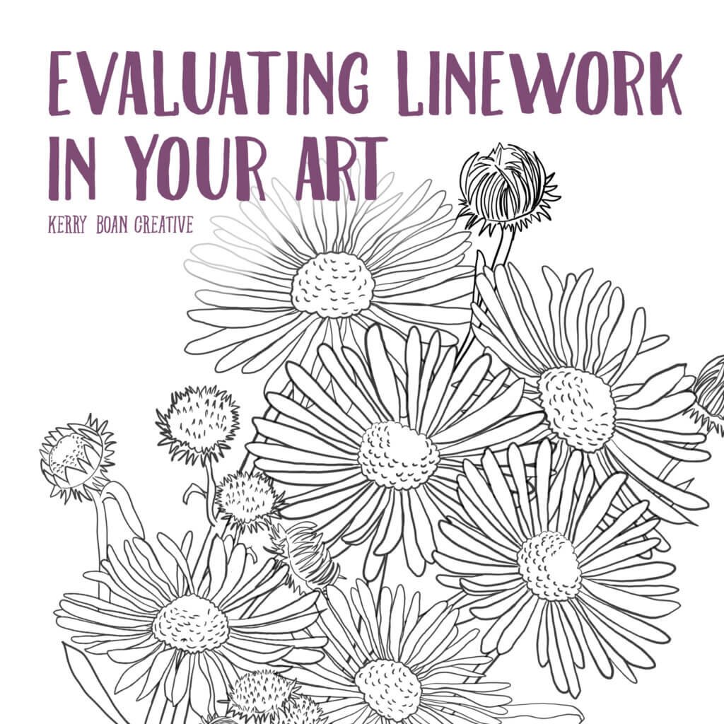
- Contour lines (lines drawn to show the inner dips, folds and form of a shape, as well as the its inner details)
- Texture (lines showing the surface quality of an object; these lines can be realistic to more decorative or patterned, and can be dense to sparse.)
- Expressive lines that are drawn or painted around the objects or motifs, in the background or negative space to show mood, emotion, movement, and more.
- Decorative marks are lines that add embellishment to the background, foreground or elsewhere in the illustration. They might be scribbles, doodles, flourishes, patterns and more.
- Did I miss something? Add your own.
Line Quality
- Thin and delicate
- Thick or bold
- Varied (both thin & thick lines or individual lines that have variation.)
- Uniform or monoline
- Smooth and fluid
- Jagged and angular
- Sketchy or hand-drawn/painted
- Clean and crisp
Line Expression
- Curved and organic
- Straight or rigid
- Repeated and patterned
- Energetic and vibrant
- Calm
Line Density
- Sparse (minimal, only where needed)
- Balanced (line & open space feel equal)
- Dense (a lot of lines, busy, detailed)