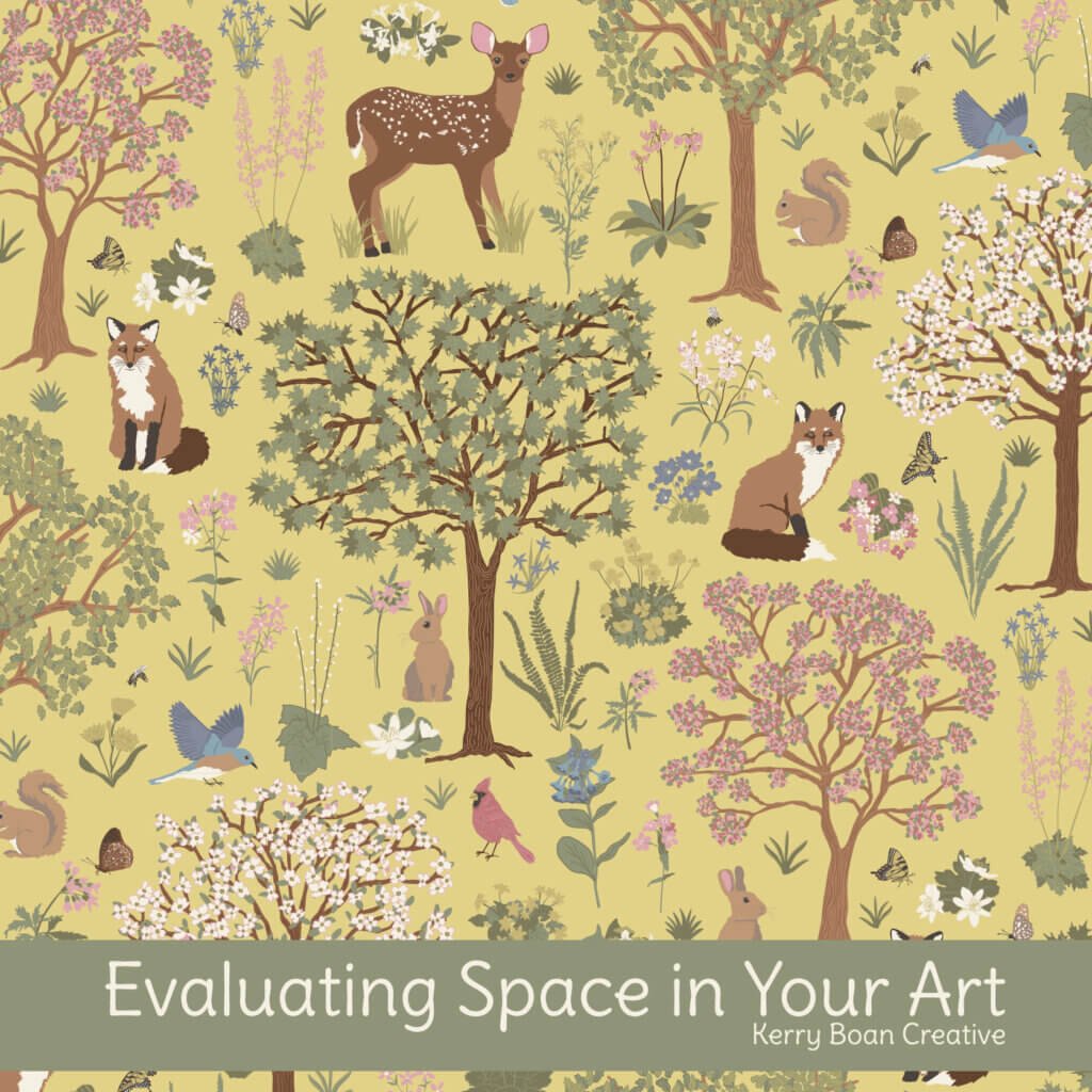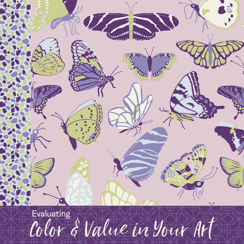
Of all the seven elements of art, color is typically the one that grabs people first. For me, it isn’t only about what colors are chosen, it’s about how they’re combined, how light or dark they are, and the overall mood they create. That’s where value comes in. Color and value go hand in hand, so it makes sense to look at them together.
When you’re evaluating color and value, the goal isn’t to identify every single swatch in the illustration. Instead, step back and take in the overall impression of the work. Look at the palette, how the colors play off one another, the contrast, and the mood. Over time, you’ll see what you consistently respond to, and that can become part of the visual vocabulary for your own work.
Color palette
- Monochrome (variations of one color)
- Limited palette (a few colors repeated)
- Full spectrum (wide range of colors)
- Analogous (colors next to each other on the wheel)
- Complementary (opposites, like blue + orange)
- Triadic or split-complementary (three-color harmony)
Saturation & intensity
Are the colors strong and bold, or soft and muted?
- Bold & vibrant
- Muted or desaturated
- Pastel or light
- Earthy / natural
- High contrast (bright next to dull or light next to dark)
Color temperature
Does the piece lean warm, cool, or somewhere in between?
- Warm (reds, oranges, yellows)
- Cool (blues, greens, violets)
- Balanced (mix of warm + cool)
- Shifted (mostly cool with a warm accent, or vice versa)
Application style
How are the colors actually used in the artwork?
- Flat fills (solid blocks)
- Transparent layers (overlaps, watercolor effect)
- Gradients or blended areas
- Patterned or textured fills
- Sparse use of color (mostly neutral/line with small pops)
Color relationships
How do the colors interact with each other?
- Harmonious (smooth, subtle transitions)
- Contrasting (sharply different)
- Dominant + accent (one main, others supporting)
- Even balance (all colors feel equal)
- Pop of color (one or two bold, saturated, or bright hues against more muted or neutral tones)
- Unexpected palette (unusual or surprising combinations)
Value range
What is the overall lightness and darkness of the illustration?
- High contrast (extremes of light and dark)
- Low contrast (all mid-tones, subtle differences)
- Mostly light and airy
- Mostly dark and moody
- Balanced range of light and dark
Color personality
Finally, what mood does the combination of colors and values create?
- Playful or whimsical
- Sophisticated and elegant
- Calm and soothing
- Soft, innocent and pure
- Dramatic and intense
- Earthy, natural or casual
- Quirky and unexpected
- Ethereal, dreamy or otherworldly
If you’d like to dive deeper into how specific colors can influence mood and emotion, ColorPsychology.org has an excellent overview.